
Qlik Sense has many different visualizations: bar chart, mekko chart, histogram etc. If you are new to data visualization, you may have difficulty choosing which type of chart to use to make your data more easily understood. For this reason, I present four main data presentation types: relationship, comparison, composition and distribution, assign each chart to one type and highlight some tips, which will help you to decide when to use each type of visualizations.
COMPARISON CHARTS
Comparison charts are used to compare two or more categorical values or show changes over a period of time. For example, to compare number of inland lakes in the continents. In short, if you want to compare your data, you should use one of the charts below.
Bar chart
Bar charts are one of the most widely used visualizations that allow comparison of categorical data (ex.: age groups, countries, companies). It can be both vertical and horizontal. The width of the columns is the same for each category, and the height (length) corresponds to the values they represent.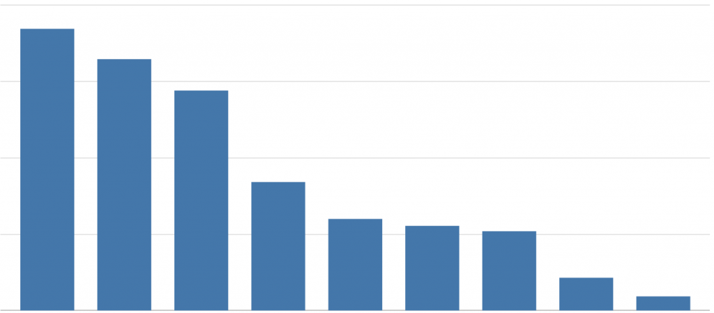
USE:
When you want to compare and represent differences in a dimension.
Table and Pivot Table
One of the main charts for accurate data presentation is the table and the pivot table. The advantage of these charts is that you can show many indicators at once and their units of measurement can vary. In pivot table you can additionally manage the table, that means, transform columns into rows and vice versa, which gives different angles of analysis and allows you to see different subtotals.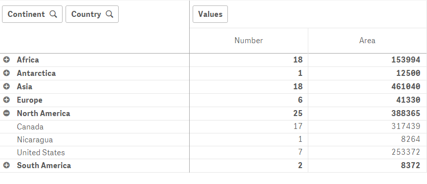
USE:
- When you want to compare and view individual indicator values.
- When accurate data is needed
Line chart
A line chart is used to show a trend over time. The dimension is used on the horizontal axis and the indicator on the vertical axis. The dimension should be a continuous scale and for this reason a date field (ex.: years, months, days) is usually used. Using Qlik Sense not only it is possible to show a single indicator trend, but also use 2 dimensions and 1 indicator, or even 1 dimension and up to 15 indicators. However, it is not advisable to use more than 3 indicators in a single line chart, because the chart can becomes overcrowded difficult to analyze.
USE:
- to show a trend and track changes over time
- to compare different indicators over the same period of time
Combo chart
The combo chart consists of two charts: line and bar chart. In this chart you have not one y-axis but two, which can specify different units of measurement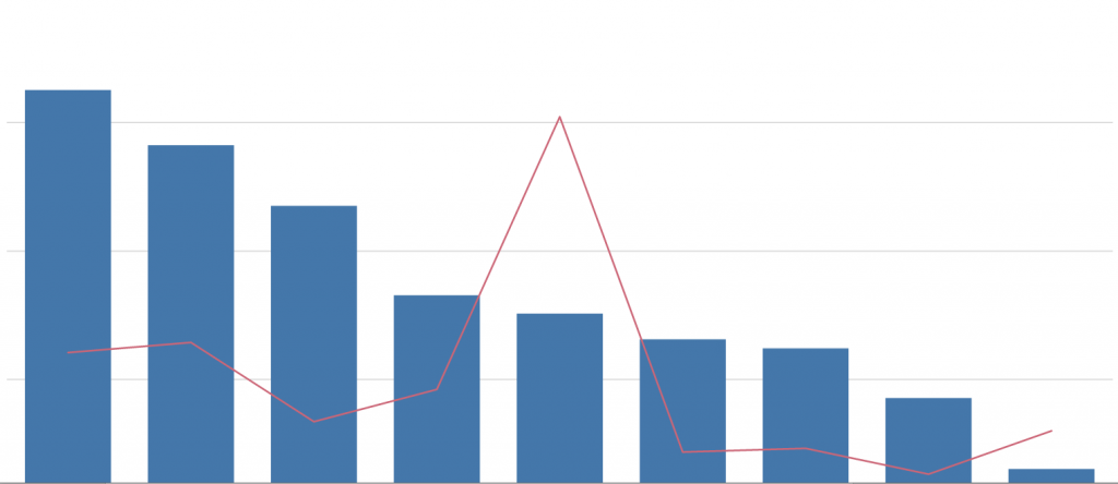
USE:
- to compare two different indicators when their measurement scales are different.
- to show how one indicator affects another
- to save available space
COMPOSITION CHARTS
Composition charts provide the least accurate information about the data. Charts of this type usually show a part-to-whole relationship. When using these charts, the amount of parts used should also be considered, as this may complicate data analysis.
Pie chart
A pie chart is a circular statistical graph that is divided into parts to show how all the data is distributed. The size of each part is proportional to the data it represents.
USE:
- When you want to show the structure of a categorical field.
- When you want to see what percentage of each field value is in relation to the whole field.
Waterfall chart
The waterfall diagram shows how the final value was reached by adding and subtracting from the initial value of the indicator. The initial and final values are represented by a bar in the visualization, and the intermediate values are represented as floating blocks, which increase and / or decrease the initial value to show how the final value is reached.
USE:
When you want to show in detail how indicator values have changed, such as how sales have changed (increased or decreased) each month.
Treemap
Treemaps are designed to represent large amounts of hierarchical data. Nested rectangles are used to represent hierarchical data in a treemap, meaning that the first dimension is represented by large rectangles, and each subsequent dimension is represented by smaller rectangles in those large rectangles. The size of the rectangle depends on the indicator we are depicting.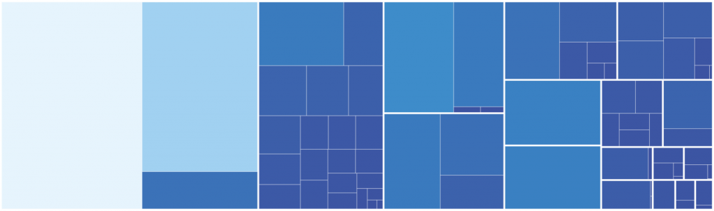
USE:
This chart type is convenient to use when you have a large amount of hierarchical data and you want to visualize part-to-whole relationship rather than accurately compare categories.
Mekko chart
This chart is similar to a bar chart, but unlike it, the Mekko chart uses two dimensions to express each indicator, which means that not only does the column height change, as in a bar chart, but the column width also changes. This chart is not used for accurate comparisons because not all segments are arranged next to another along a common starting point.
USE:
When you want to provide more general information about the data, compare groups with each other and the influence of categories within each group.
Relationship chart
In relationship chart you can determine correlations of variables, outliers or clusters. It is a great choice if you want to see if an indicator affects or not another indicator.
Scatter plot
Scatter plot is a set of points that represent the values of two different indicators over one dimension. The third indicator can also be plotted using bubble size. In this chart, unlike the others, the indicators are on both axes, and the selected dimension is represented by dots.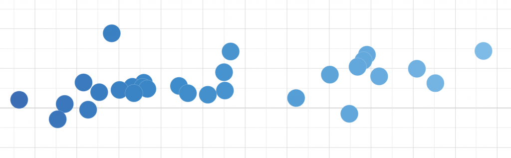
USE:
- to determine the relationships between indicators
- to find and analyze outliers
- to notice data distribution, correlation or clusters
DISTRIBUTION CHARTS
Distribution charts are used for quick review of the indicator. These charts usually show the distribution of the data, characteristics such as dispersion, median or quartiles.
Histogram
Histogram is a bar graph graphically representing the statistical distribution. In Qlik Sense you can select the number of bins (range of values) you want, and the length of each bar will show how often the numbers occur. The histogram has similarities to the bar chart, but the essential difference is that the bar chart uses categorical data and the histogram uses quantitative data.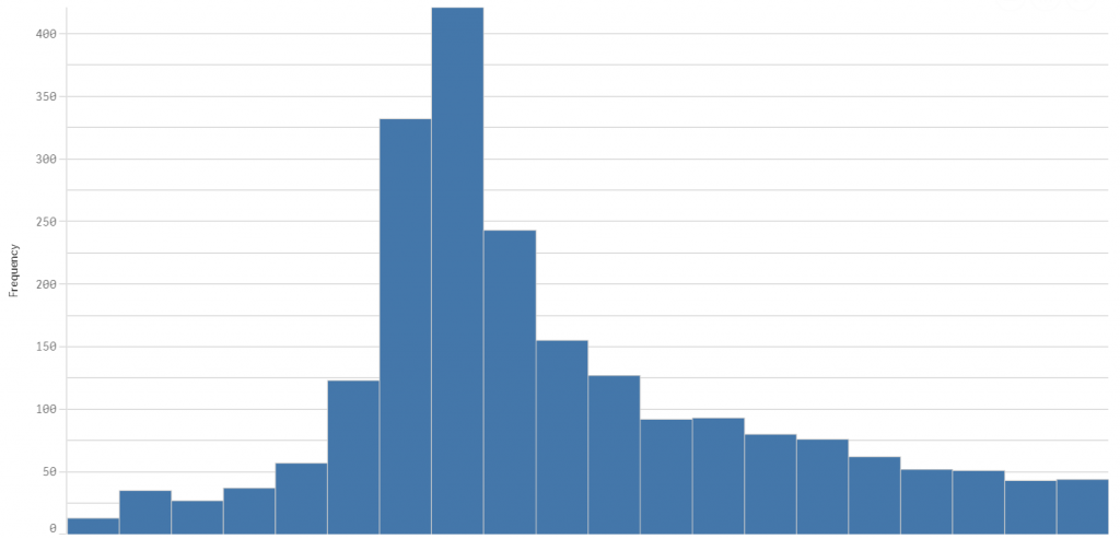
USE:
- to summarize quantitative variables and show how they are distributed
- to find outliers or gaps in the data
- to determine the median and distribution
Box plot
The box plot visually presents the distribution of the indicator and divides the data into 4 parts using 5 numbers: minimum, first quartile, median, third quartile and maximum. Each part covers about 25 percent of the data.
USE TO:
- to show the range and distribution of numerical data
- to find outliers
- to determine median, skewness and dispersion of the data
Map
Use a map chart if geographical distribution is important to your data. Using this visualization, you can present quantitative information using bubble sizes or colors.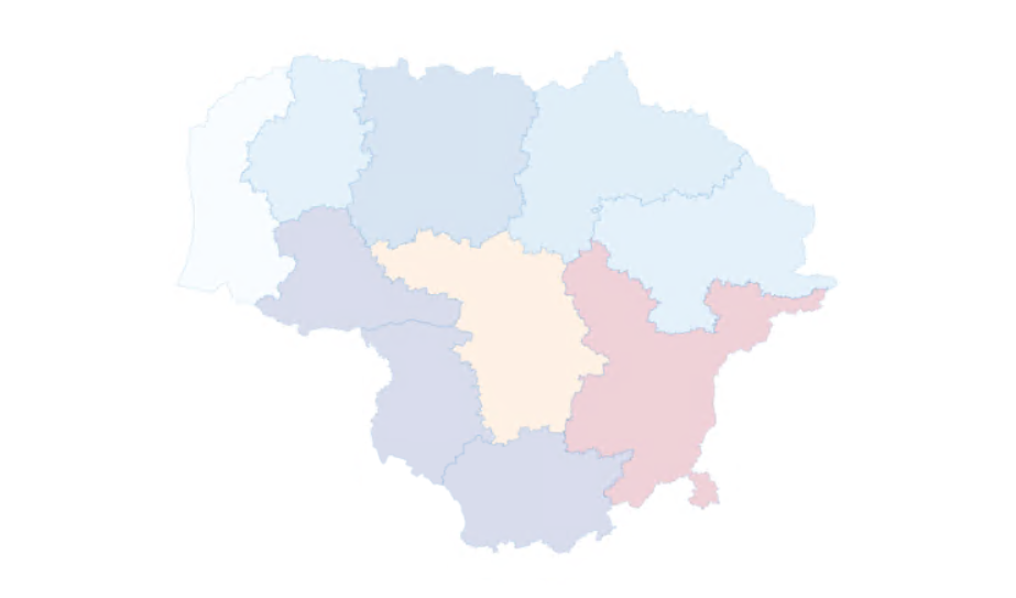
OTHER IMPORTANT VISUALIZATIONS
KPI, Gauge
These charts are a great choice if you want to display the exact value of the indicator and track its progress toward the set goal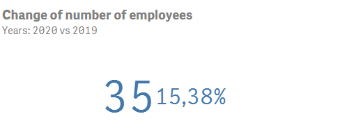
Container
The container provides the ability to change the visualization you want to see on the sheet. This is very useful when there is limited space. Also, with the help of the container, different visualizations that are accessible to the user can be displayed.
Filter pane
The purpose of the filter pane is to filter the dimensions in a data set. This is very useful when you have a lot of data and want to analyze it, for example, only for a certain period, region or product.
Text & Image
With the text & image chart you can add the required information both on the first page of the application and in the following. Links can also be provided that will give the user more useful information. Moreover, in many cases, this chart is used to add a company logo or other meaningful image.
FINAL THOUGHTS
The choice of chart depends primarily on what exactly you want your data to show. So, if you know the purpose of your visualization, you are already halfway there. In this article, charts are assigned to the type in which they are most used. It is not said that they cannot be assigned to another type of visualization and used for another purpose. You can always break away from the standards by trying different charts and maybe you will find new insights.