
Choosing a color scheme can be a headache for anything you are trying to create. A great scheme is an important factor in creating data visualizations that are intuitive and accessible to viewers. A good set of colors will draw people’s attention to the most important parts of your data, while a bad one can distract or even mislead.
Fortunately, we have a few great tips and general rules of thumb when working with colors on your visualizations.
WHAT TO USE?
Before doing anything with your data you need to understand the purpose of the colors and how they could help highlight the important parts in your data and more importantly not make it harder to understand. There are three main categories of data that we should distinguish.
Sequential scheme
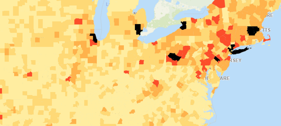
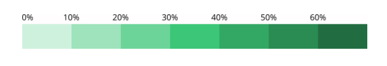
When the data set is organized in a logical order, usually numeric, then sequential scheme is the best choice. Colors are assigned in a progression usually based on lightness or hue.
The most common use of this scheme is a gradient color scheme. Lower values represent light colors, and higher values are represented with darker colors.
This color scheme is usually used to represent maps as the different hues are easier to distinguish when they are close to one another.
Diverging scheme

This scheme is best used when your data has a meaningful deviation from the central value. A divergent scheme is a combination of two different sequential color schemes sharing a common endpoint at the center
Values that are larger than the center are assigned to one side of the scheme, while smaller values to the other. Each ends of the spectrum are represented by darker colors, while central values are left with lighter colors.
Using this scheme, it is easier for the viewer to distinguish positive and negative values relative to the center.
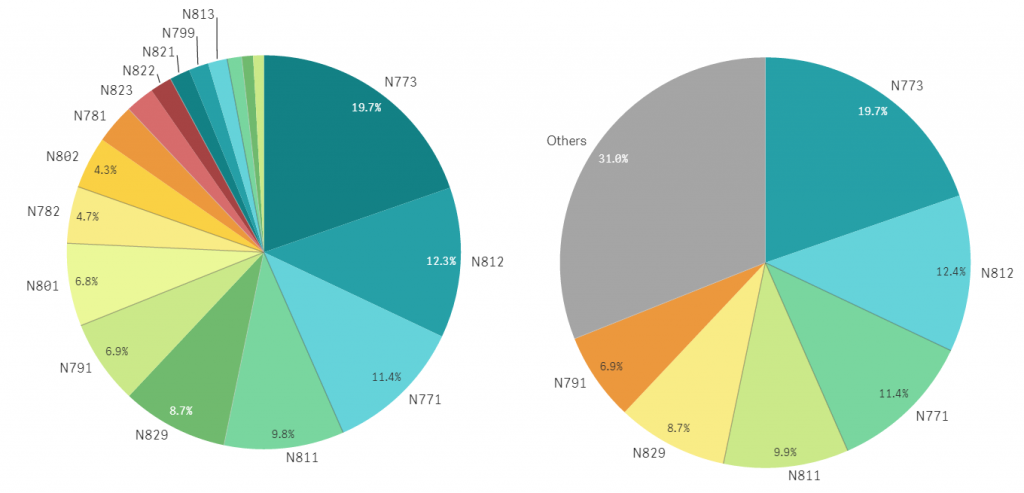
Qualitative scheme
A qualitative scheme is best used when data in question is non-numerical, and categorical in nature. An example of such data would be country, state, gender or race. Each value in the data set is assigned its own color that are distinct from other values.
You should avoid having more than seven to ten colors as having more can become confusing and hard to distinguish. However, if there are more groups than colors then it is best to group them together and call it “other”.
Another thing to note is that you should avoid using the same color or similar hues for different data as that can become confusing, unless those data points are closely related.
ADDITIONAL TIPS
Be consistent
When using multiple charts in the same dashboard or report it is advisable to try and stick to the same colors when referencing same groups and entities. If the colors change meanings between chart it can become confusing.
Avoid overdoing it
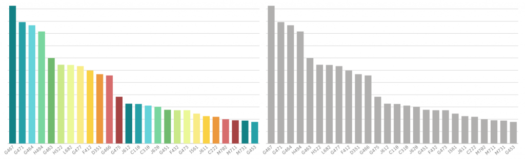
While it is tempting to use color in every chart to show what is important in them it is often better to show some restraint and only use color when it’s appropriate. More often than not a bar chart, with only one measure, would not need more than one color to highlight its data points as they are already clear by looking at the height or length of the bars. Colors would only be introduced with additional measures.
On the other end of the spectrum, colors can be used to highlight data that is important by making them stand out from the rest of the elements. That is why it is often stated, that grey is the most important color in data visualization.
THE PERFECT TOOL
Considering everything that you have learned, there is a great tool that makes applying all of these tips easy and quick. From choosing single colors to represent one dimensional data set to picking pre-selected sequential and diverging color schemes with the ability to create your own. All of this and more is possible using QLIK SENSE. If you would like to learn more you can read more or reach out to us and our specialist will contact you and help you achieve best possible solutions for your business data analysis team.
TAKE AWAY
Selecting colors in data visualization is not merely an aesthetic choice. It plays an important role in conveying quantitative information. A good color scheme can highlight the story you want your data to tell and a bad one can completely distort that vision. When picking a color scheme consider how many data points you have, what kind of data it is, and what information you want your visualization to convey to the viewer. When in doubt you can always reach out to our specialists that will be more than happy to help.
Check out these tools to help you pick the right choice when it comes to colors:
- Colour Picker For Data – a color tool where you can hold chroma constant and pick your palette.
- Color Hunt – a library of pre-made color schemes.
- Color Oracle – a free color blindness simulator for Window, Mac and Linux.
- Designspiration.net – a great site with thousands of graphics.
- Adobe Color CC – a tool for creating your own color schemes.
- Colorbrewer2.org – a great tool for finding heat map and data visualization colors.
- FlatUIColorpicker.com – a great tool for color inspiration.